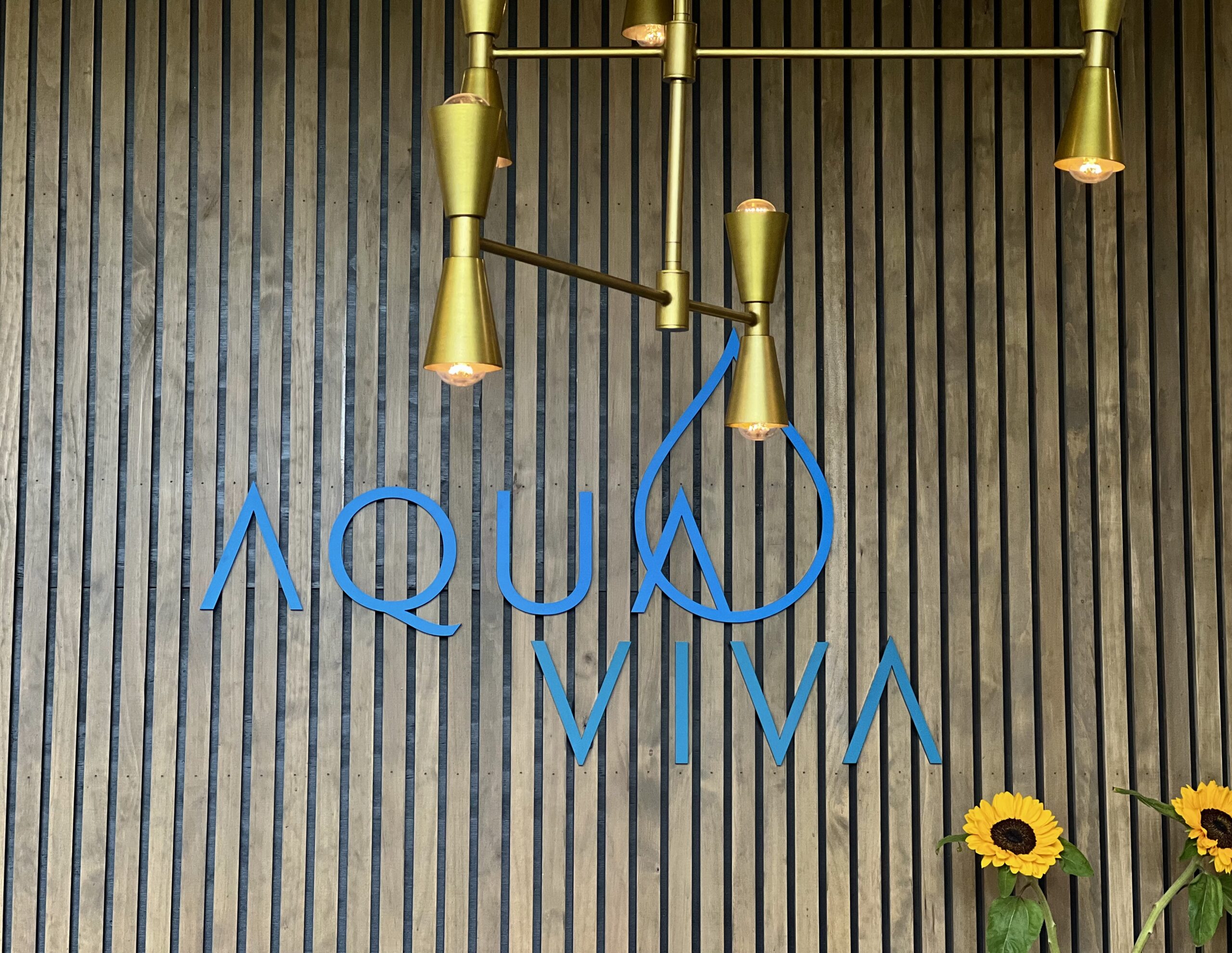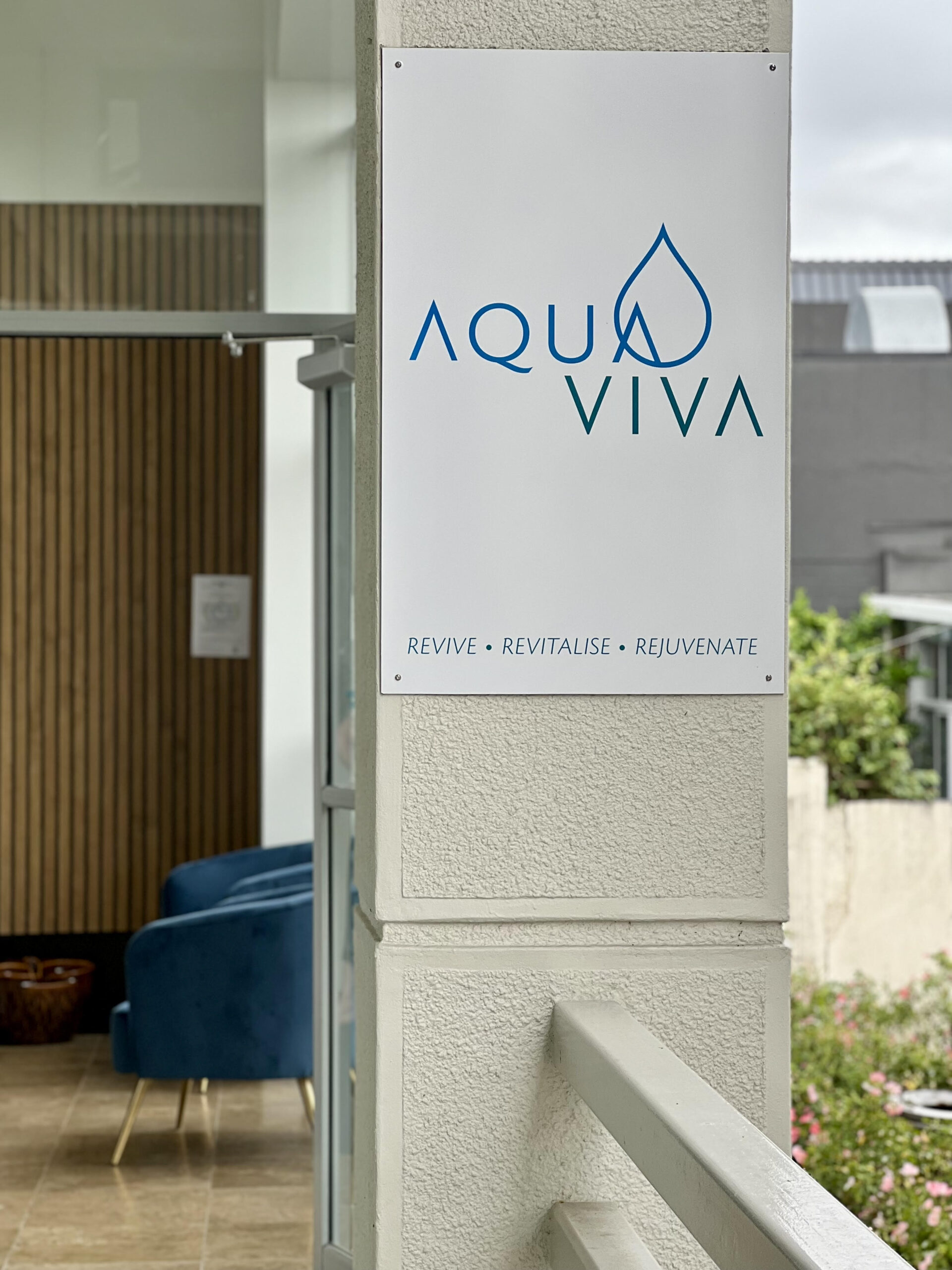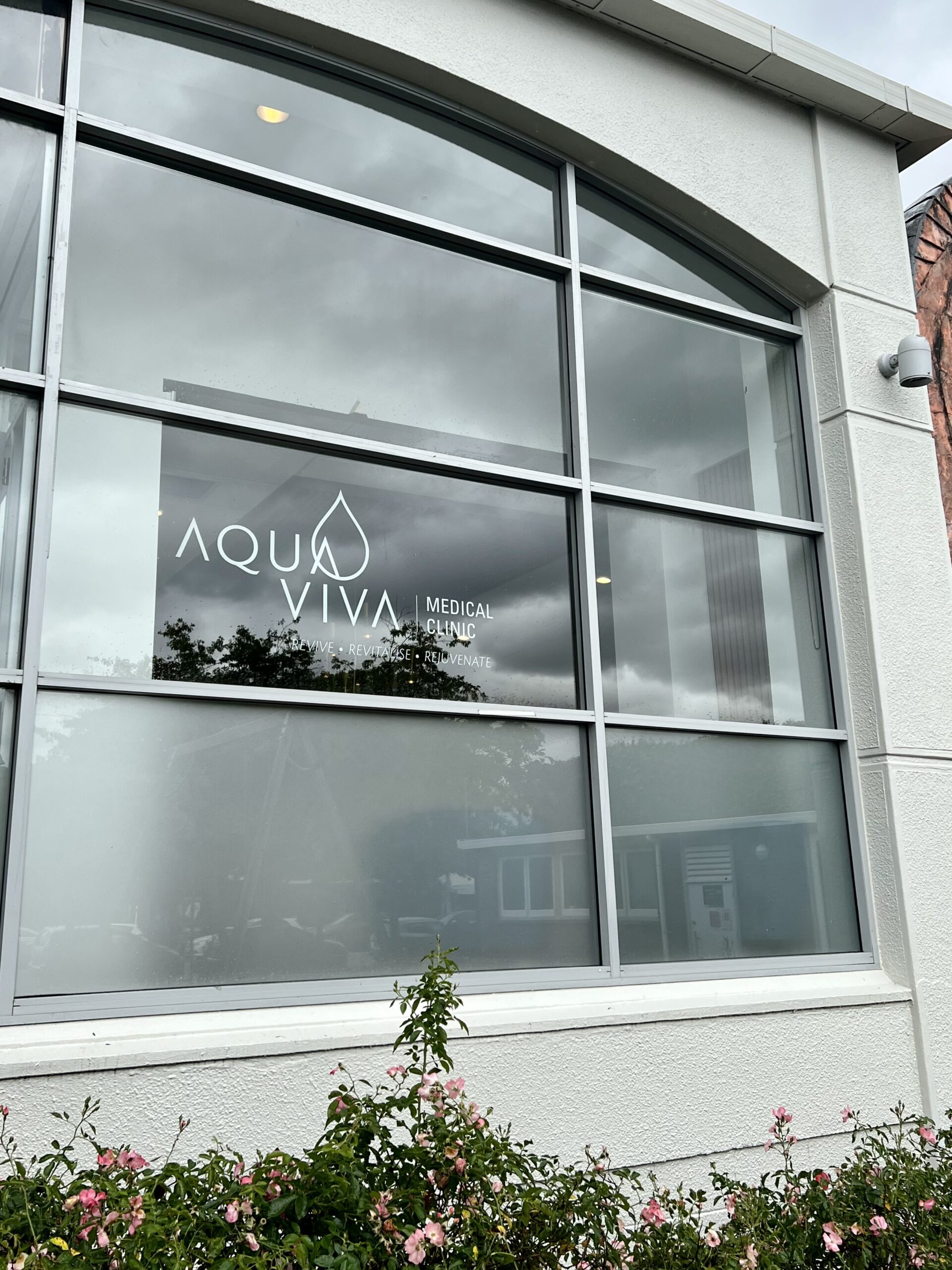


Aqua = water
Viva = goodwill or approval, often meaning long life
Approaching the logo design for a new holistic health practice in Parnell, Auckland which offers a GP service and is an IV lounge for infusions and other specialist treatments, we looked to history.
In alchemy, the element of water is represented by an inverted triangle, which we used as inspiration for the ‘A’s and ‘V’s. And the last ‘A’ of Aqua is positioned to line up with the two ‘V’s of Viva, creating a zig zag waveform, a nod to an ancient symbol for water.
A simple, elegant yet strong font was chosen, with the cross bars of the A removed to help create a sleek look and feel. With the letters purposely spaced, the water droplet intersects to become part of the ‘A’ of Aqua, a simple shape representing both water and infusions.
Evoking water, the blue and the green colours were chosen to work together harmoniously, providing distinction for each word as well as creating a tight visual unit.
Photos of the signage at the premises: behind the reception desk, the pillar by the front entrance, the front window facing Heard Park in Parnell
