Setting the baseline
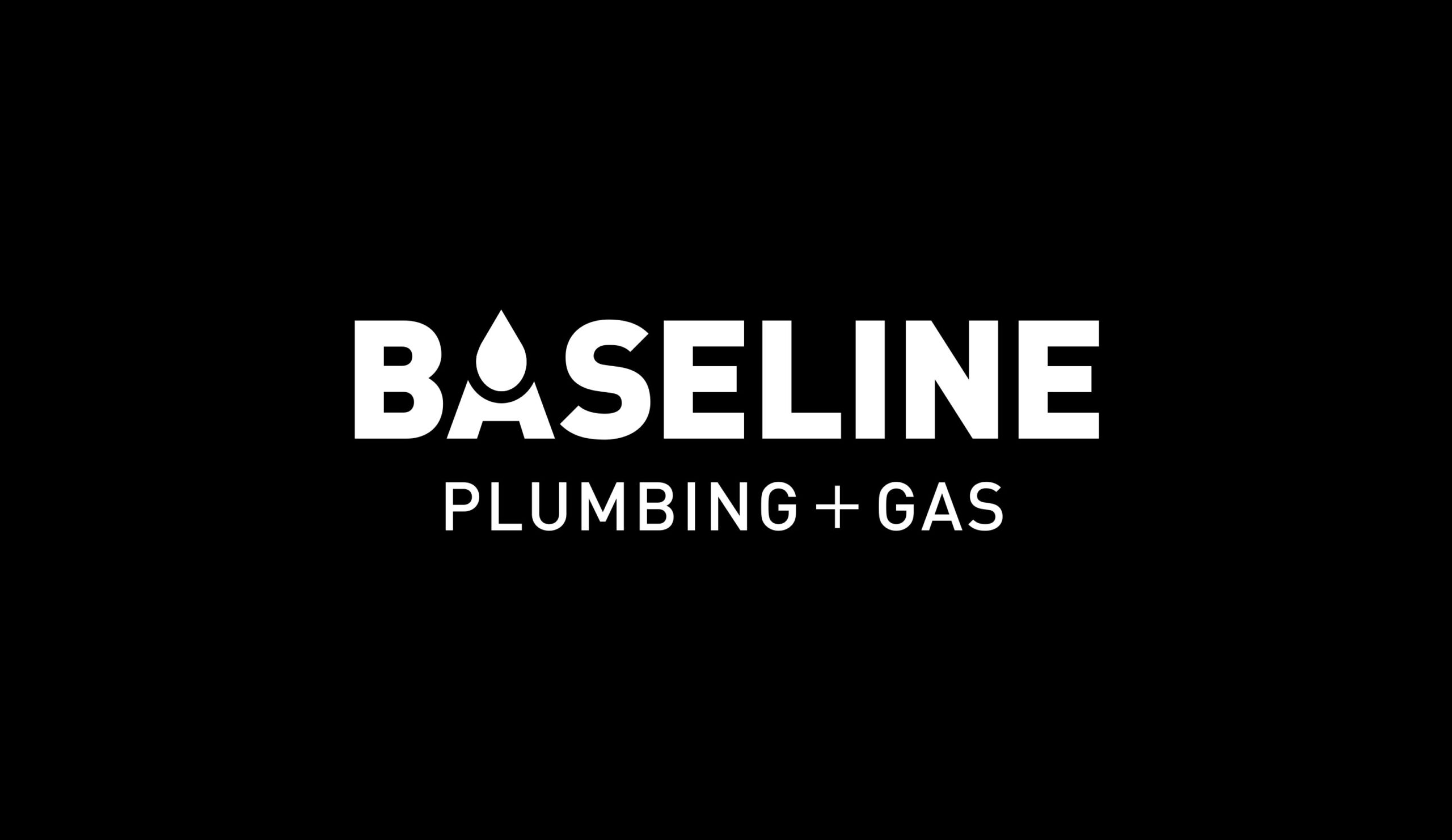
Inspired by the client’s idea of incorporating a water drop into the design and wanting all caps for the wording, we chose a horizontal aspect for the logotype, rather than having a symbol sitting above the wording. This makes a tidier shape and is more suitable for a lot of website templates as well.
The contrast in the sizing of the two lines of text is to provide a hierarchy of information (the business name being the most important), and for a balanced look. A ‘+’ sign is used rather than an ampersand (&), to be more visually simple and streamlined.
A bold weight of a modern sans serif typeface is used for ‘BASELINE’, with a lighter weight of the same typeface used for ‘PLUMBING’ and ‘GAS’, and a slightly lighter weight for the ‘+’.
The ‘A’ is made up of two simple shapes crafted into a water drop, which doubles as a flame of sorts for gas. The space between the two shapes creates a line – a baseline, a ripple.
Wanting their logo to be in black and white only, the brand has been designed to be easily adaptable for all media, including website, uniforms, vehicles, stationery, email and social media.
