
Business cards are really just small billboards
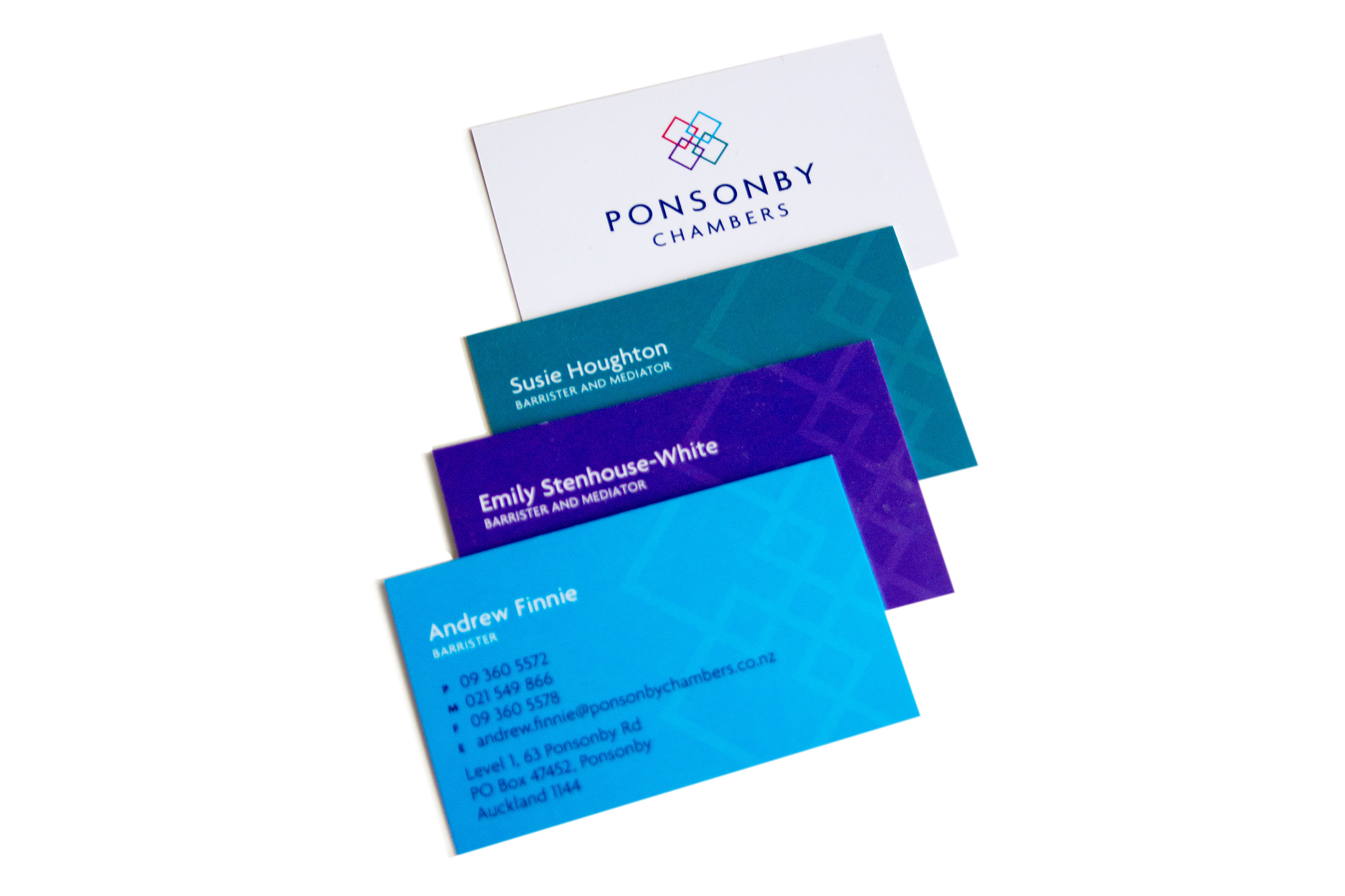
Ponsonby Chambers
An Auckland-based legal chambers comprising of four lawyers.
Each lawyer has been assigned a colour from the logo to help distinguish their brand, primarily used in their business cards.
This helps reinforce the overall brand. The cards are double sided, with the logo and website on one side and the lawyer details on the other.
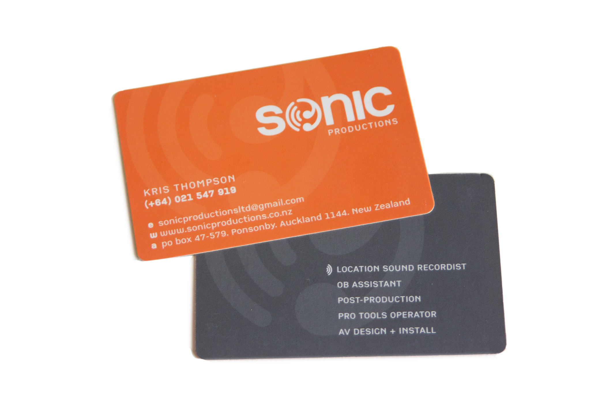
Sonic Productions
Boldy presented in orange with a complementary grey on the reverse, these cards are eyecatching and fun.
The icon from the logotype is used as a supergraphic on both sides to create visual interest and reinforce the brand.
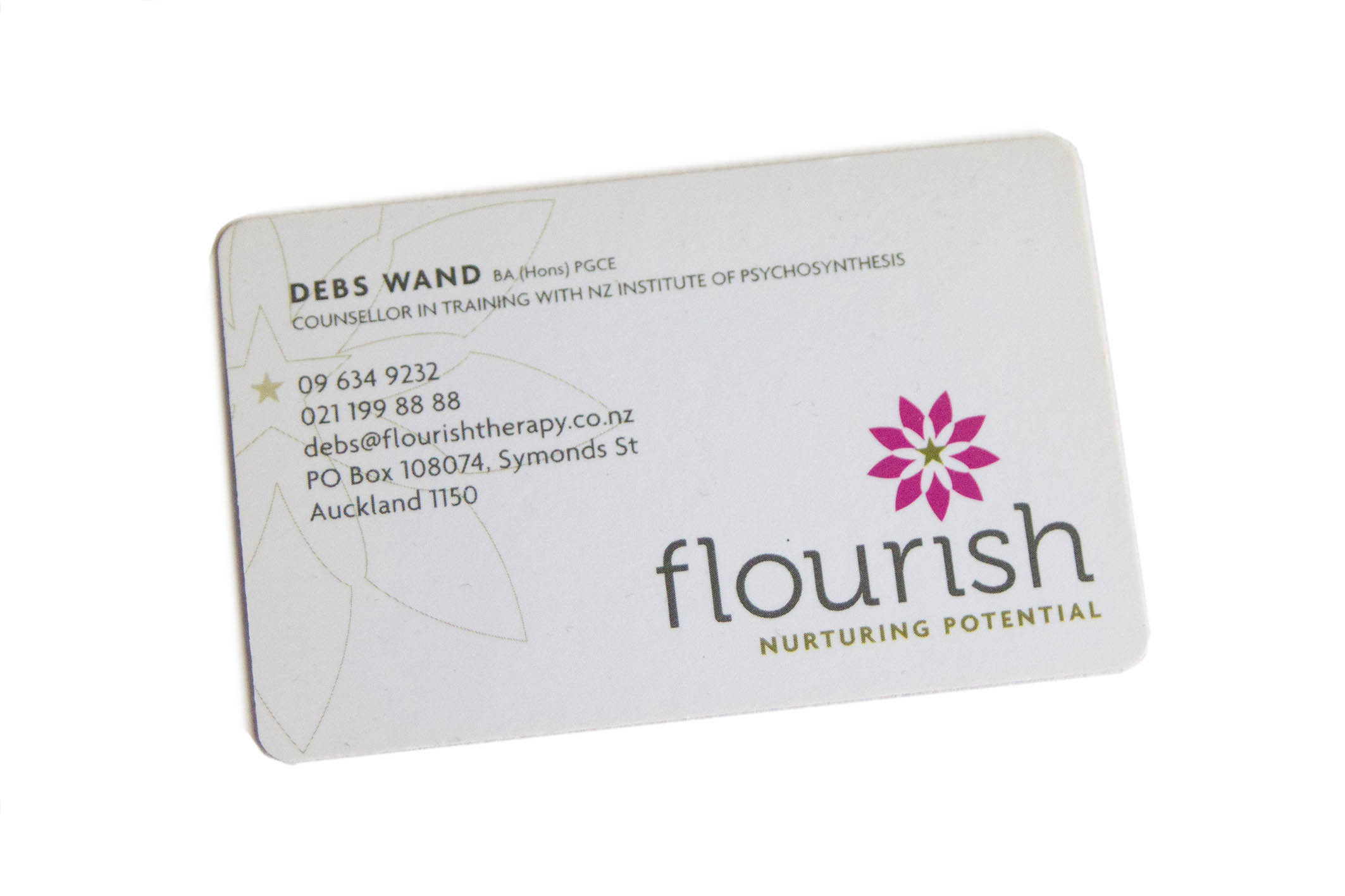
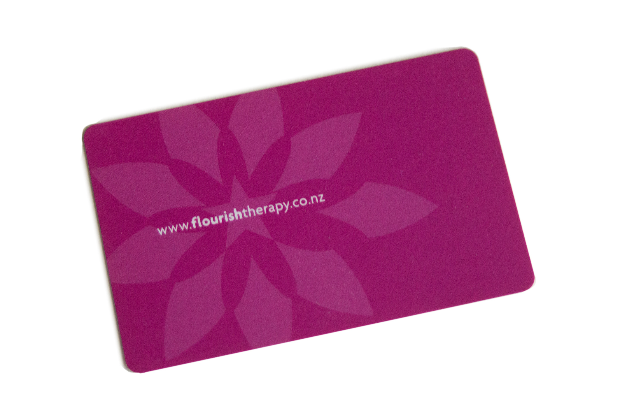
Flourish
The floral motif of the logo is used as a supergraphic on both sides of the card in two different ways.
Placement of the supergraphic on the front is purposeful, with the gold star highlighting the contact phone number.
A bolder treatment is used on the reverse with full coverage of the strong magenta colour.
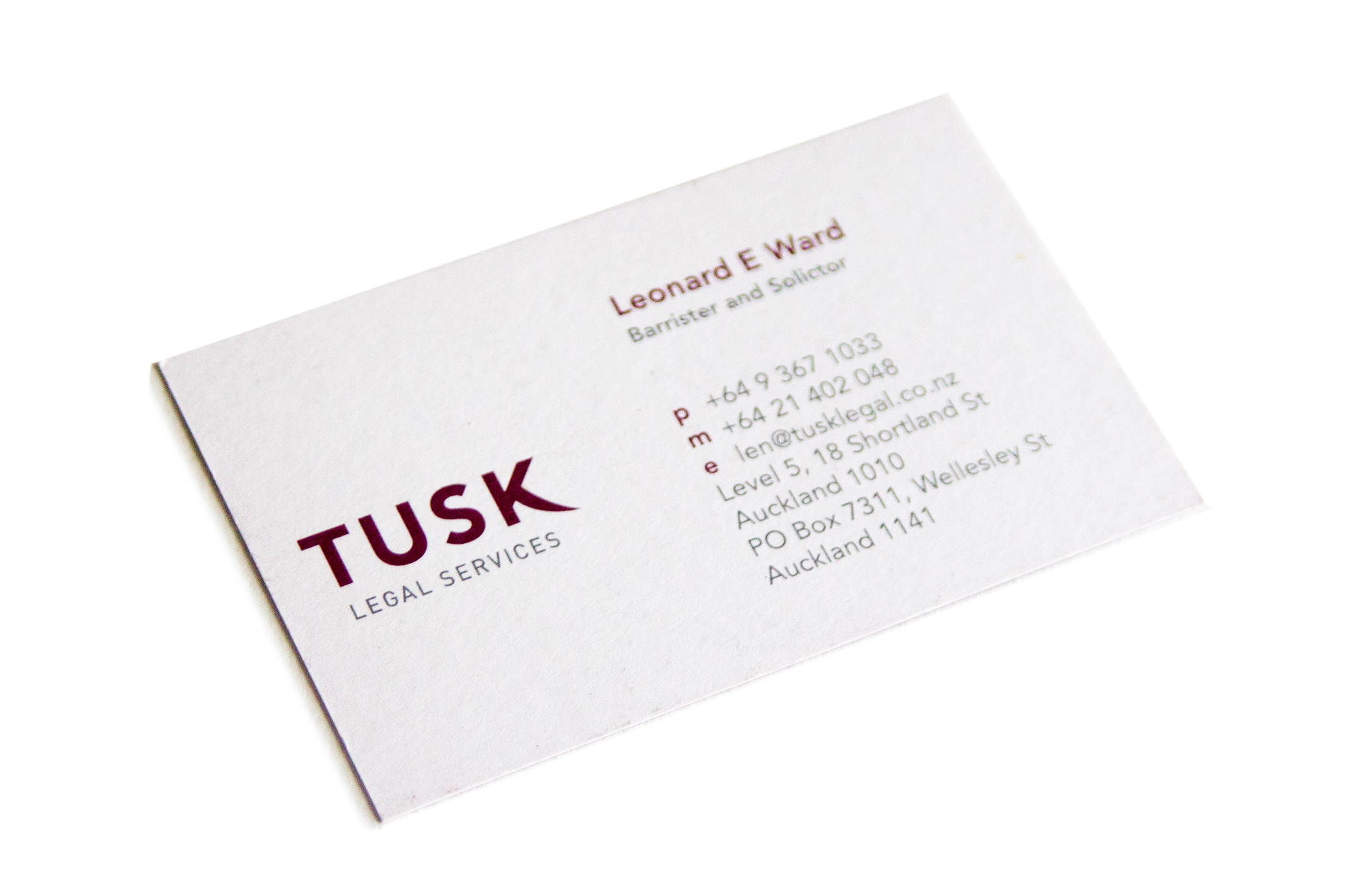
Tusk
A double-sided card design solution for Tusk, taking advantage of the strong graphic shape of the ‘K’ by reversing it out of their brand colour.
The burgundy is paired with a charcoal grey and the type kept simple and easy to read.
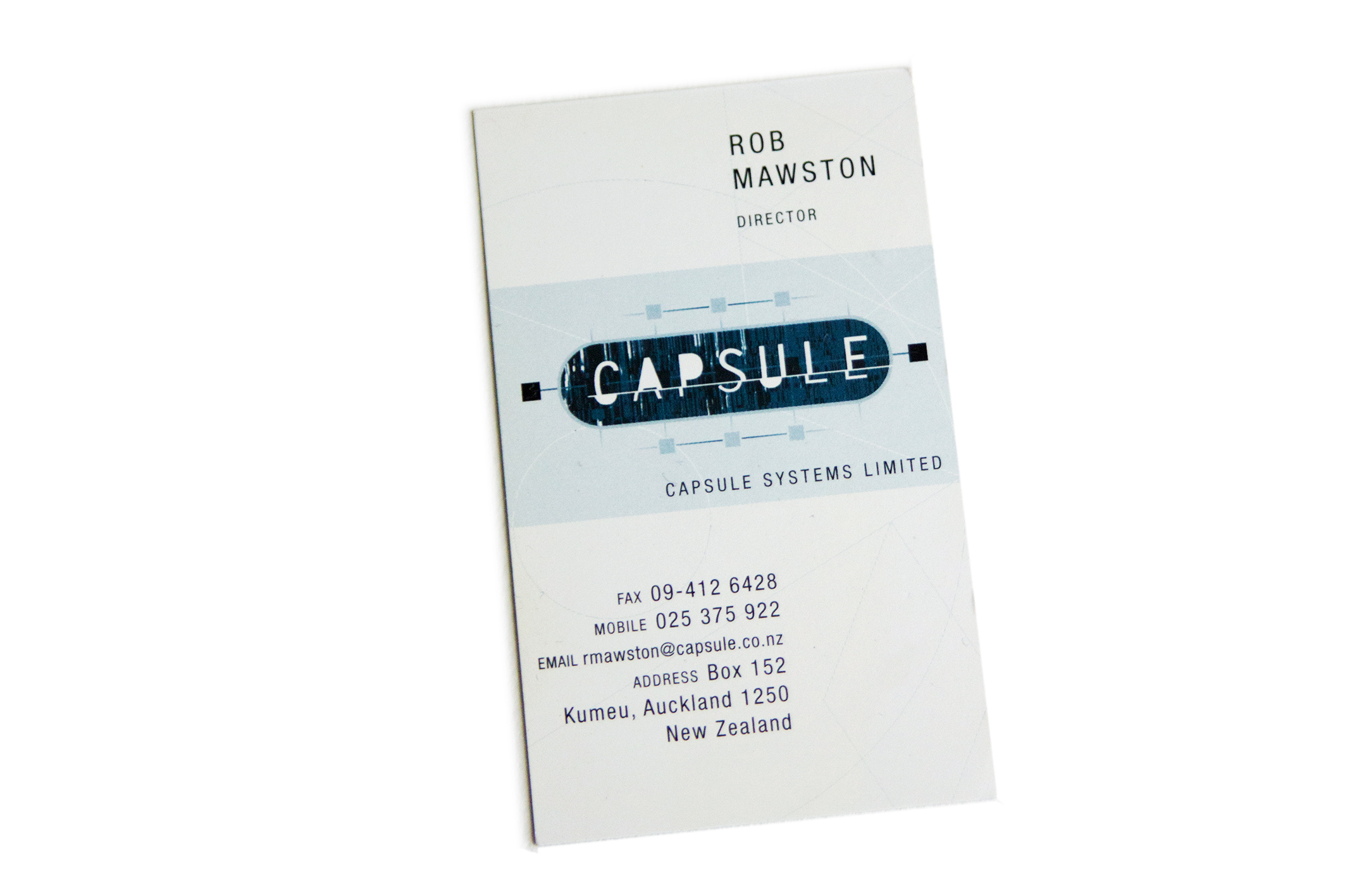
Capsule
The vertical layout is well balanced with all the information compelmenting the logo block perfectly.
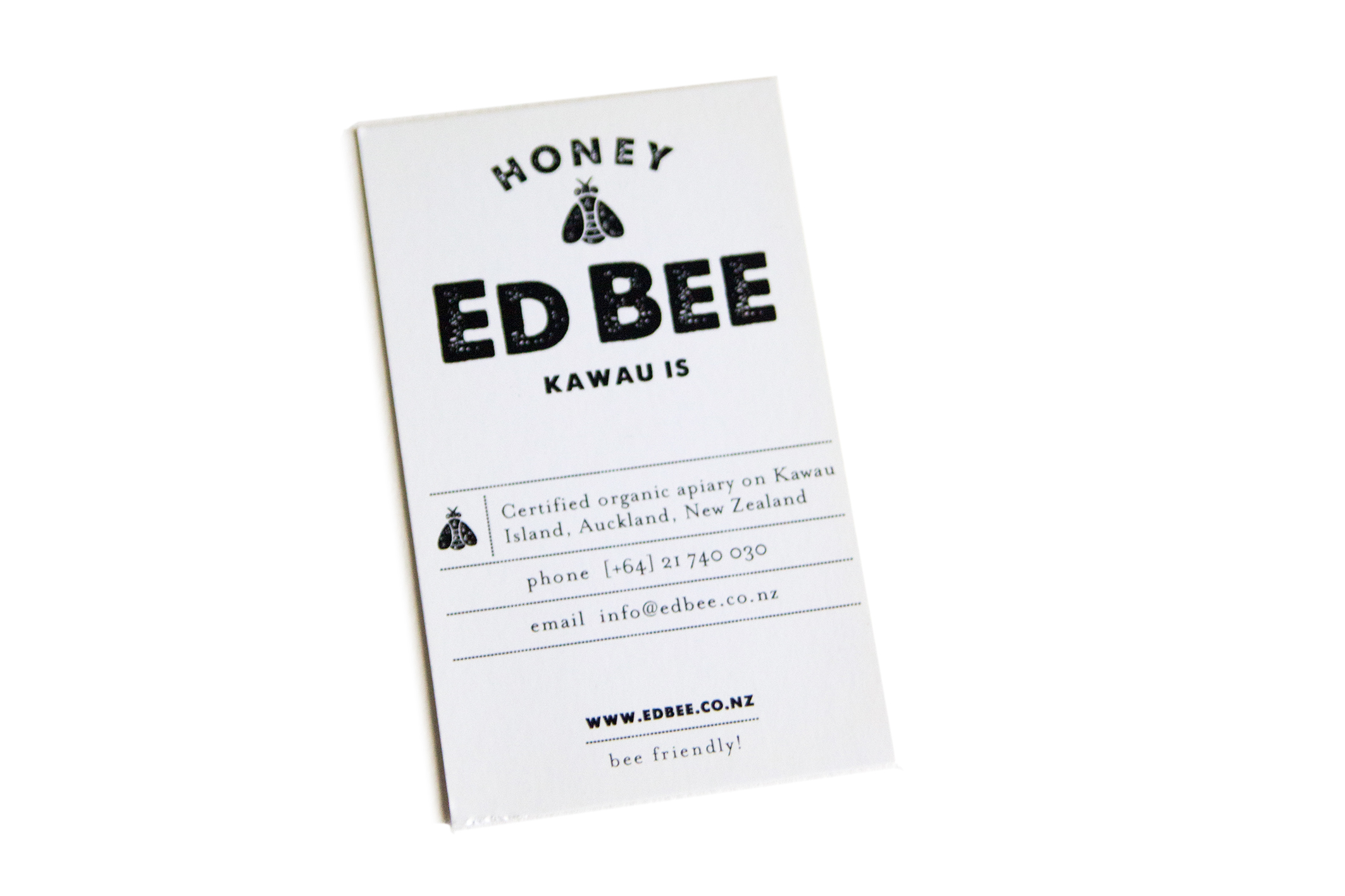
Ed Bee
Continuing the same traditional look and feel as the label, the cards are simple and clean.
All the elements from the logo and label are used to create a well-glanced vertically aligned card.