


Commercial lighting specialists based in Christchurch, New Zealand
The client wanted a modern and stylish European look and feel to their marketing collateral, more streamlined, simplified, and easy to read.
This was essential because of the important technical information required to fit on a product sheet.
After our initial consultation with ICLighting (ICL), we researched European brands to get a feel for the style, then began the design process for the product sheets, data sheets and brochures.
We went back to basics, utilising ICL’s core brand elements: the rays of light, the warm, bold colours, and the strong graduations, incorporating them all into the designs for brand consistency.
Throughout the process, we had to keep in mind that the finished designs were being supplied as In Design templates for all the brochures and sheets to be produced in-house by the client.
The Before and After
In each visual example, the client’s existing designs are featured smaller, on the left, and the new designs sit to the right of them.
Top to bottom:
Brochure front cover
Brochure back cover
Product sheet
Data sheet
Icons
For a more up close view, feel free to download pdfs versions of the new designs using the links above.
Brochures and Product Sheets
On both front and back covers, intersecting light beams become a visual device to hold the logo, giving it clear space and emphasis no matter what image on the cover is used. The device creates strong angles, a real warmth, and is totally on brand.
The title text of the cover is in a white sans serif font in line with existing branding.
The front cover’s right hand side edge has a triangular graduated shape in brand colours which anchors the page.
On the back cover, important information is arranged clearly in three coluimns, including a short positioning statement. The strong use of ICL’s brand colours allows for a bold yet friendly look and feel.
The Product Sheets are visually consistent with the covers. The light beam graphic is used at the top of each page in warm tones of orange, yellow and red, anchoring the headings. All imagery fits below, sitting across the page as a cohesive visual unit. The information below sits in four columns; two for the technical information, one for diagrams / details, and one for icons.
We moved the logo from the bottom of the page to the top, and the footer now holds the website url and the range the lighting belongs to.
The single page Product Sheets are able to be adapted from the multi-page brochure design as the content is similar.
Data Sheets
The Data Sheets design is based on the brochure and uses some of the same elements. Images are given more prominence, with technical information kept in the lower half of the page.
The product name sits over a transparent panel, allowing more of the image to be visible as well as being a reference to light. The logo moves top right so it is immediately seen. To the right of the main image is space for icons / additional information.
Technical data is clearly laid out in tables, with lines to differentiate each entry, making it easy for the customer to read.
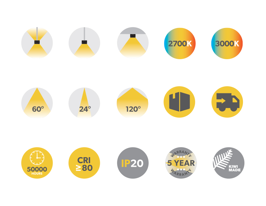
Icons
A range of unique icons has been developed for ICL to use across all product sheets, and on their website. Circular in shape, they are representative of a spotlight, and are mostly in tones of yellow and charcoal. The style is designed to be as simplified as possible for easy visual reference.