
by shelley watson | Jun 28, 2023
A hub for all services and people in beauty related industries, our client wanted a design solution encompassing connecting, sharing, professionalism, fun, warmth and networking. The logo is all of these things, with the symbol representing ‘b’ for Beauty, and white...
by shelley watson | Aug 23, 2022
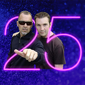
Like many artists, New Zealand’s iconic dance music duo, Bevan Keys (Nice) and Peter Urlich, faced unprecedented rescheduling challenges in late 2021 and eearly 2022 with lockdowns and restrictions which impacted the entertainment industry. 25 years together is...

by shelley watson | Aug 23, 2022
eMHIC connects leaders, professionals and enthusiasts of eMental Health to share knowledge and collaborate. The challenge was how to communicate what eMHIC is about in an effective visual way. The approach we agreed on was an infographic for their 2022 Sponsorship...
by shelley watson | May 4, 2022
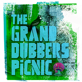
AUM festival held a small mid-winter event on its festival site in 2020 and 2021, bringing much joy during strange pandemic times. In 2022, the musical direction changed to a highly talented Dub-based line up featuring some top New Zealand talent. The word ‘Picnic’...

by shelley watson | Feb 24, 2022
Setting the baseline Inspired by the client’s idea of incorporating a water drop into the design and wanting all caps for the wording, we chose a horizontal aspect for the logotype, rather than having a symbol sitting above the wording. This makes a tidier shape and...
Recent Comments