The joy of play
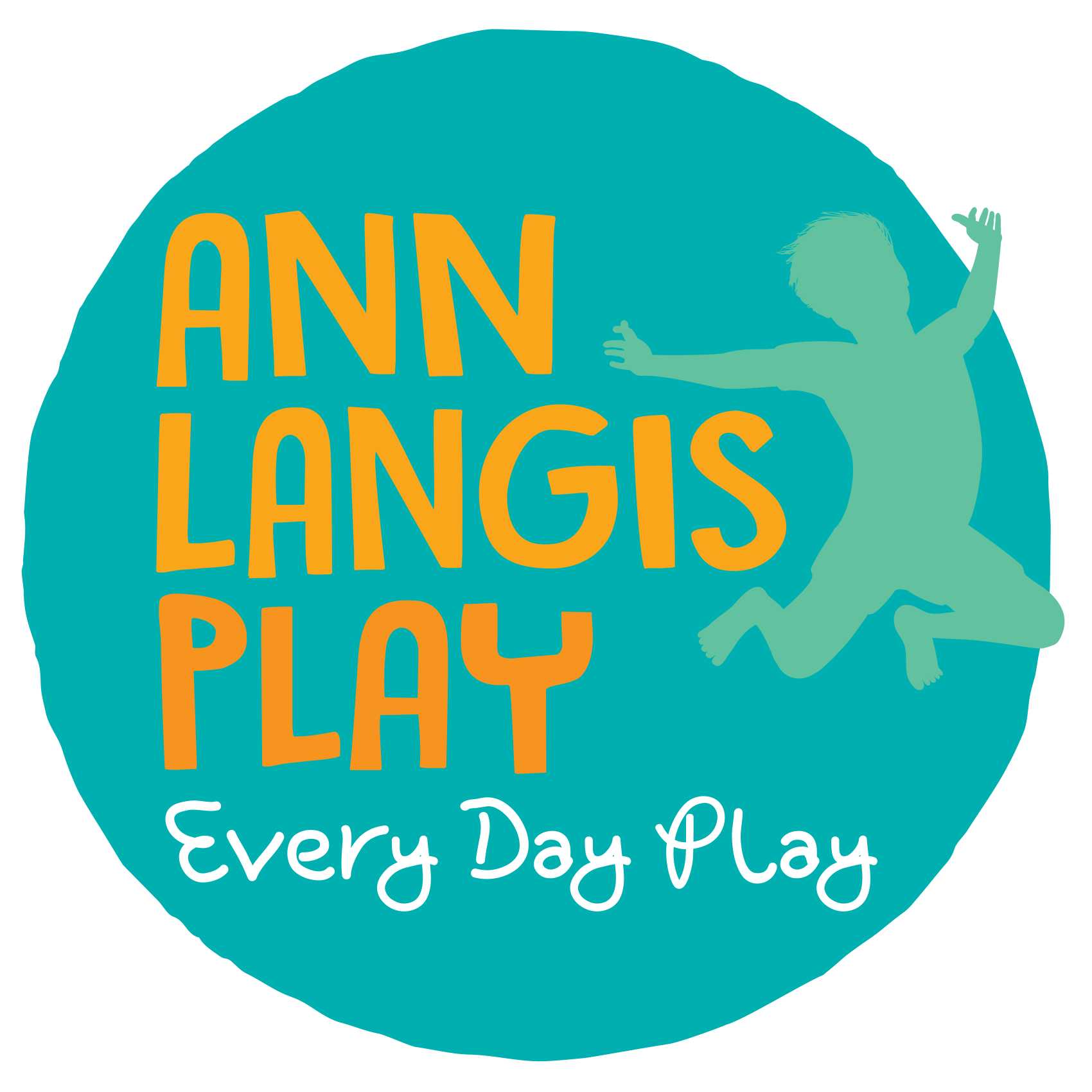
Establishing a distinctive look and feel for Ann Langis Play that was energetic yet grounded, and represented the joy of outdoor child play, was the vision for the business owner. It needed to be friendly and trusted and appeal to educators, government agencies, and businesses, as well as inspire confidence and be personable. Professional and fun, the solution reflects Ann Langis and her business in a modern funky way.
A freeform circular shape has a child leaping for joy out of it, expressing the fun and absolute delight of outdoor play in the simplest way possible. Tucking the child in amongst the lettering creates a unified symbol with the type, so they are part of each other.
The bold and chunky, hand drawn typeface used for the business name is stacked closely on top of each other, like building blocks. The typeface of the strapline is handwritten which is open and friendly, contrasting beautifully with the chunky type above it.
A vibrant turquoise blue is paired with a deep orange, complemented by the addition of a lighter goldy orange, and white.
Now more than ever, in this Covid world, don’t forget to play, every day!
