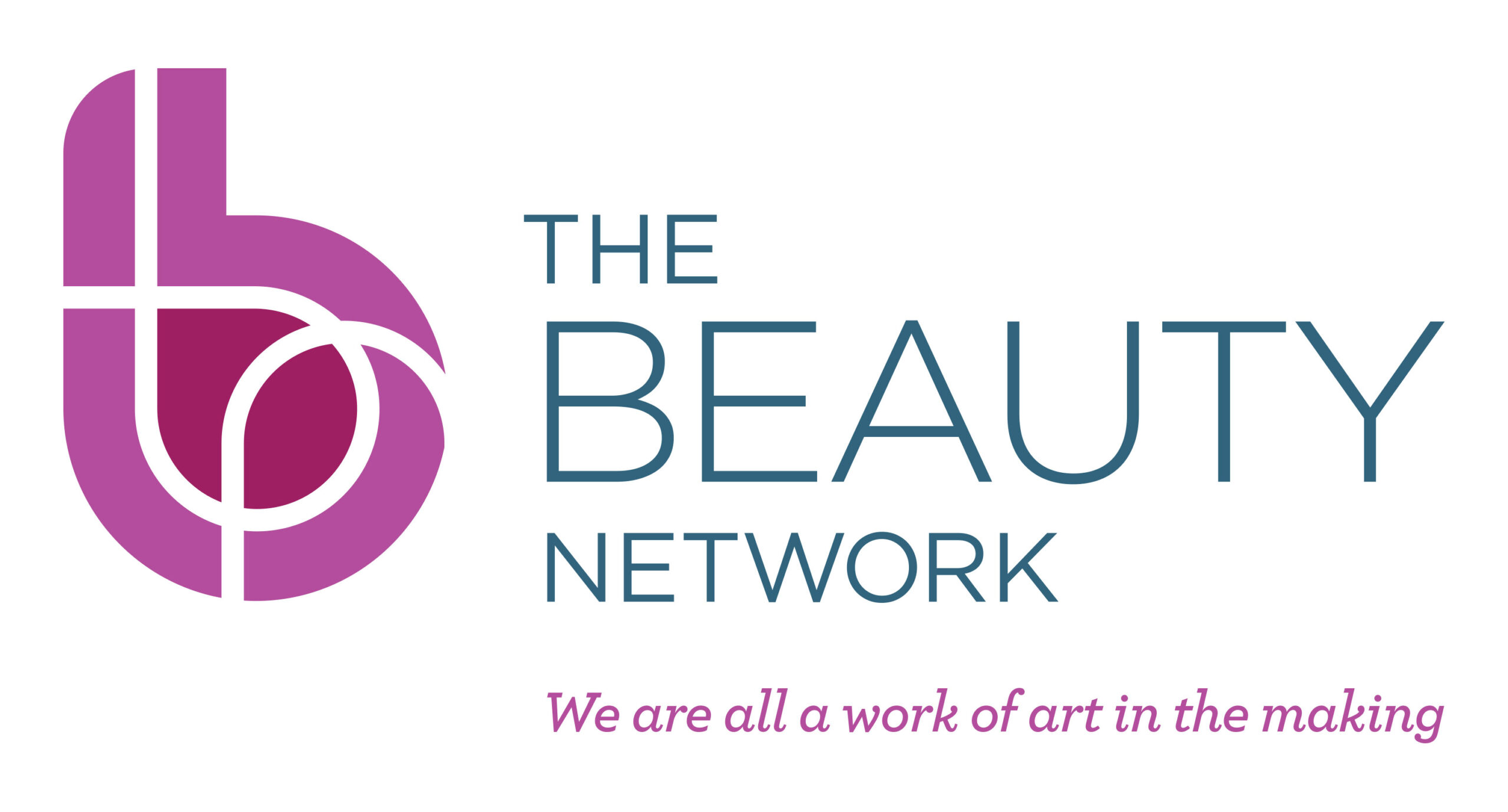
A hub for all services and people in beauty related industries, our client wanted a design solution encompassing connecting, sharing, professionalism, fun, warmth and networking.
The logo is all of these things, with the symbol representing ‘b’ for Beauty, and white inlines representing a network with their connecting shapes. The three lines are a ‘t’ for The, a ‘b’ for Beauty, and an ‘n’ for Network.
Two deep pinks work harmoniously together, creating the shape of the ‘b’. A droplet shape is created by the darker pink, referencing beauty products, such as a drop of moisturiser or foundation.
Two deep pinks work harmoniously together, creating the shape of the ‘b’. A droplet shape is created by the darker pink, referencing beauty products, such as a drop of moisturiser or foundation.
It is positioned alongside the organisation name, written in a simple yet strong font of beautifully formed letters for a clean and unfussy look and feel. The typographical block lines up with both the top and bottom of the circle of the ‘b’, and the letters are all in capitals, stacked to create a balanced visual unit. The cool sage-blue-grey colour complements the pinks.
The strapline sits nicely below in an italic semi-serif typeface, the width of ‘Beauty’, situated apart from the wording above it for differentiation and to avoid a cluttered look.
