We’re singing the blues!
Those fine people who bring you AUM festival were set to sing the blues with their inaugural Auckland Blues Festival, though it was sadly scuttled by the pandemic.
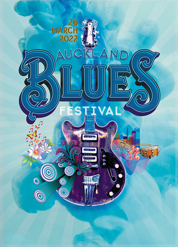
The client was after a fresh approach, with traditional blues elements in the design mix, which we have boldly achieved with the amazing lettering. From a boutique type foundry in the USA, the beautifully unique forms of the ‘Blues’ letters have been enhanced with a woodcut style infill, a dark blue outline and white inline, as well as a drop shadow.
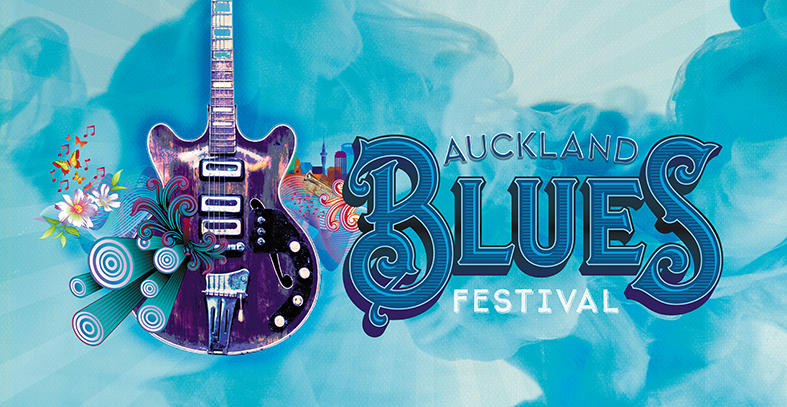
For us, blues music evokes smoky bars and guitars. The abstract blue smoke background is the perfect backdrop for a pimped up guitar. A photo reworked to be more like an illustration, the guitar is embellished with psychedelic-style explosive shapes from its core, flanked by flowers, butterflies and musical notes to reflect our quirky client. Auckland city is represented by an illustrated skyline merged into sound waves and musical instruments. All of this on a canvas of blue!
Illustrated here are the poster, Facebook event header and bus back


