
“Breath Day Out is more than just an event, it’s an adventure with a tribe of like-minded people seeking harmony and growth.”
The Breath Day Out symbol is a combination of three letters, b, d and o, with a graduated linear treatment in tones of blue, positioned to form a shape representing a breath out, getting lighter as it travels further.
And it can be turned on its side, extended, and used as a supergraphic.
Sitting in two lines to the right of the symbol, the lettering is in a stylish quirky roundish bold sans serif font, all lower case, and purposely spaced to create a compact shape.
The roundness of the letters echo the ‘o’ of the breath symbol and the lower case letters give the lettering block an open and ‘airy’ feel. It also needed to incorporate a date which could change each year.
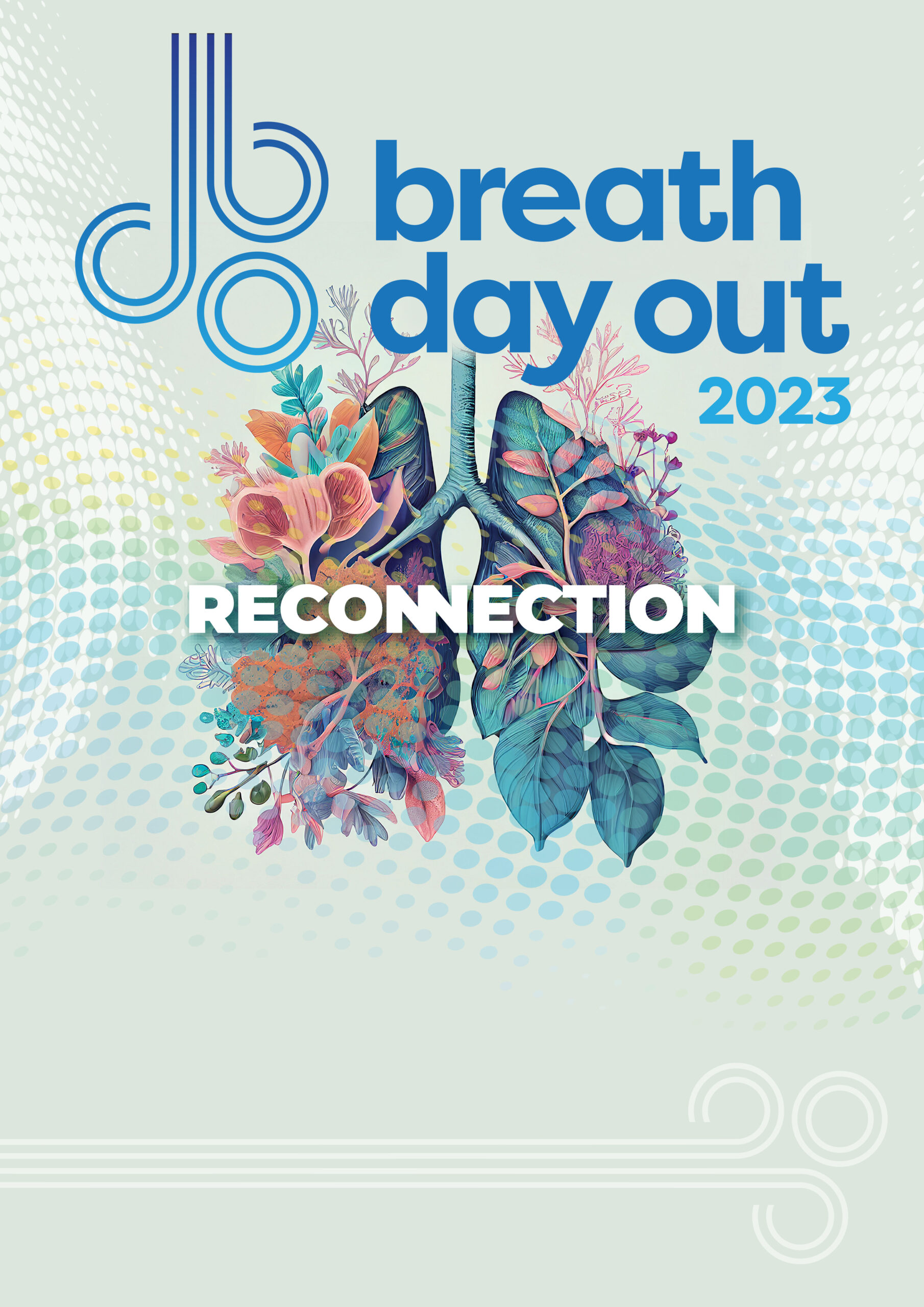
For the poster, socials and other collateral, we chose an illustration of lungs blooming with flora to represent spring, the season of the event, and the swirling dots are the breath. These elements sit on a beautiful soft sage green, light enough for the logo to pop as well as being tonally complementary.
The theme for 2023 is Reconnection. The word is in a white extra bold sans serif font with the two middle ‘N’s connected, a simple graphic device which reinforces the theme. And it has a drop shadow, so it really pops.
