John Parker Ceramics
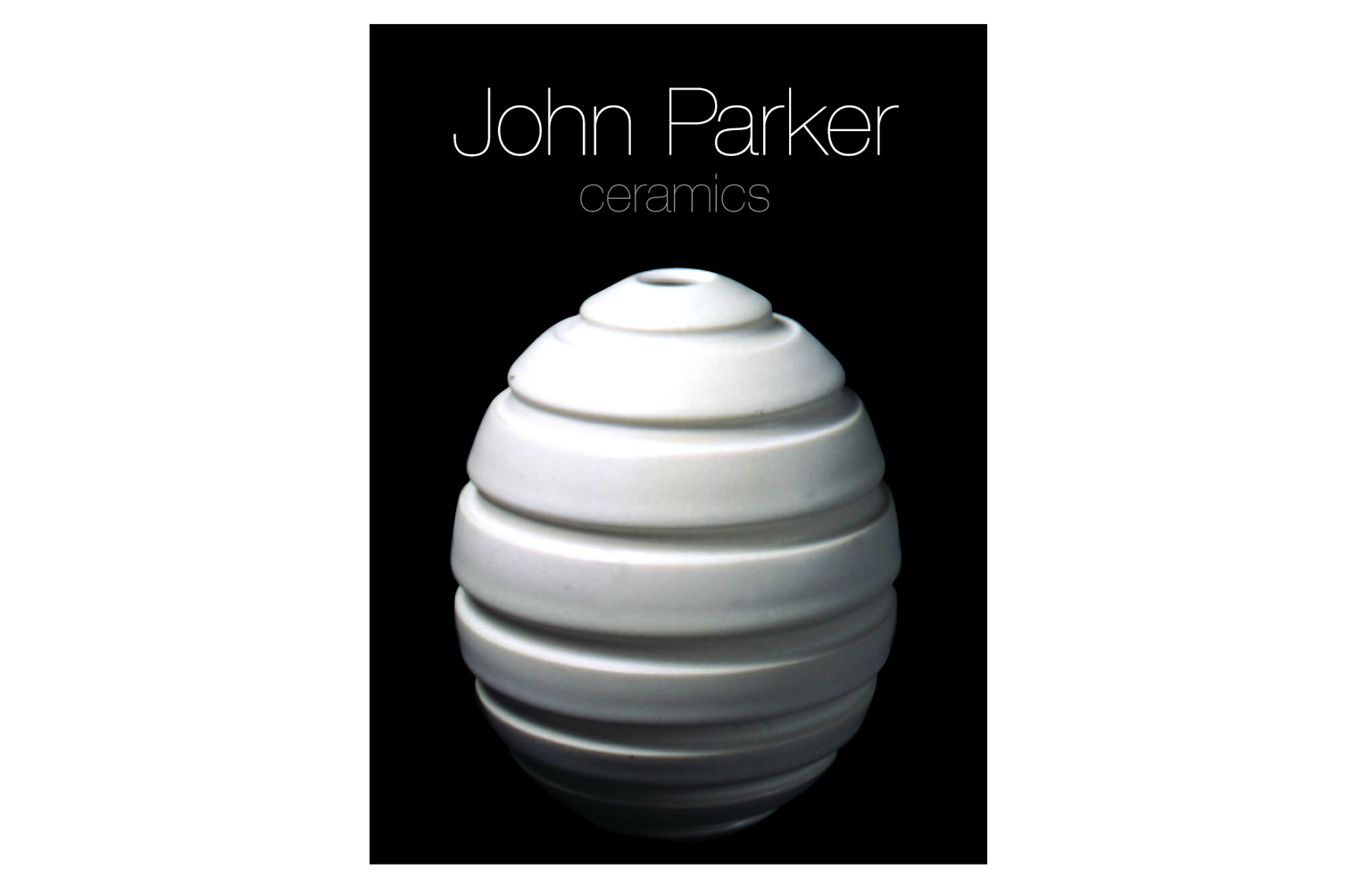
It was important that the work speak for itself, which is why we selected a simple, light typeface with clean lines.
The ceramic pieces are minimal in style and beautifully photographed so the design aptly followed suit.
Less is more.