

TalkLink Trust uses assistive technology to help enrich the lives of people with communication impairments, enabling them to live to their full potential.
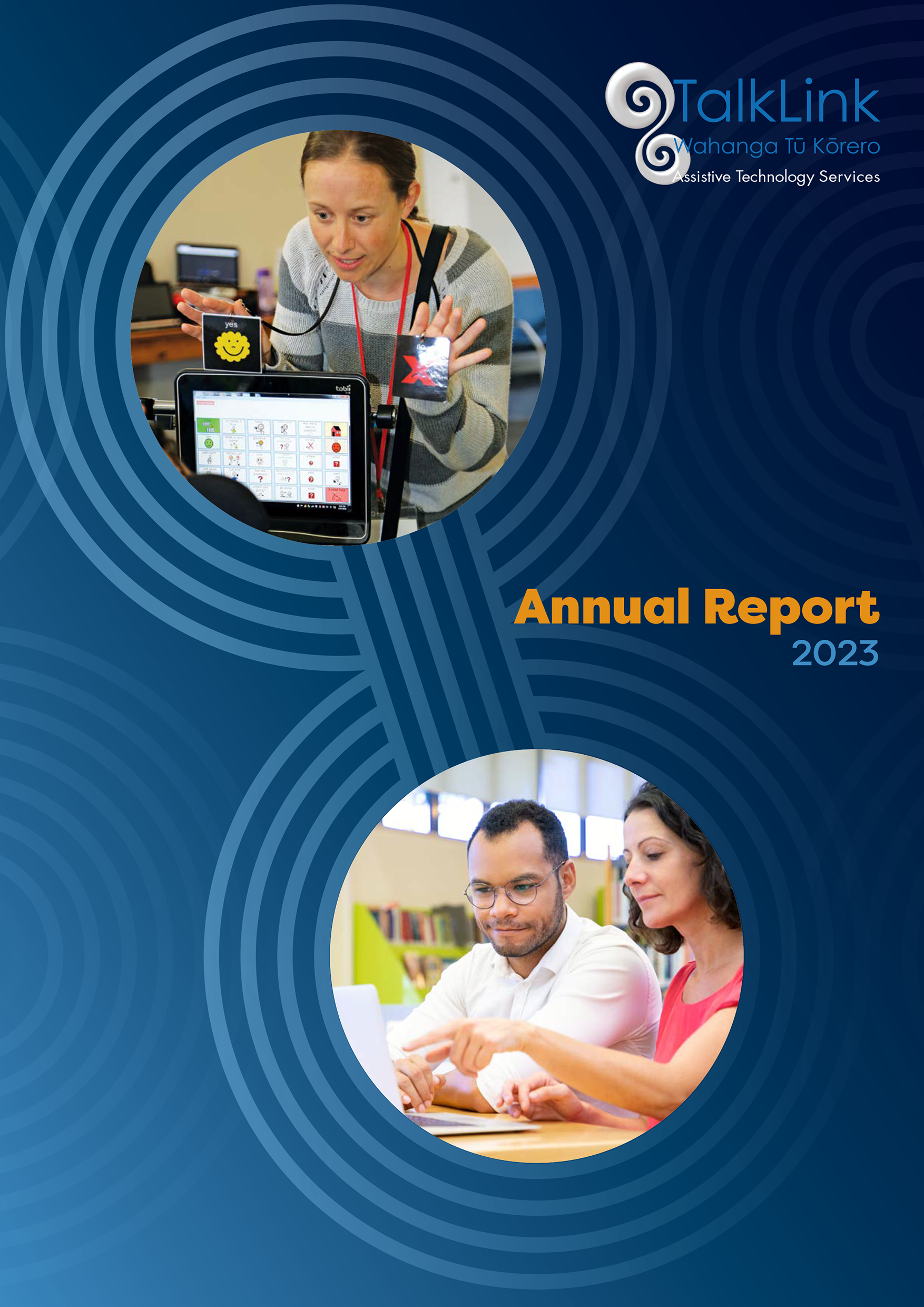
New leadership at TalkLink Trust led to a new vision for their Annual Report, and a design overhaul. Echoing the shapes of the logo, the cover features very stylised sound waves. The two main circles are linked to represent collaboration, creating frames to showcase photos of what they are about – people.
Staying on brand with blue as the main colour, we made it bold and eye-catching through the use of graduated tones, and the introduction of a complementary bright and bold orange.
We went from a one to a two-column page layout, which allows more information to fit in while increasing ease of readability with shorter line lengths.
The introduction of quotations from clients throughout helps to break up blocks of text, and selected modern typefaces were chosen to make reading easier.
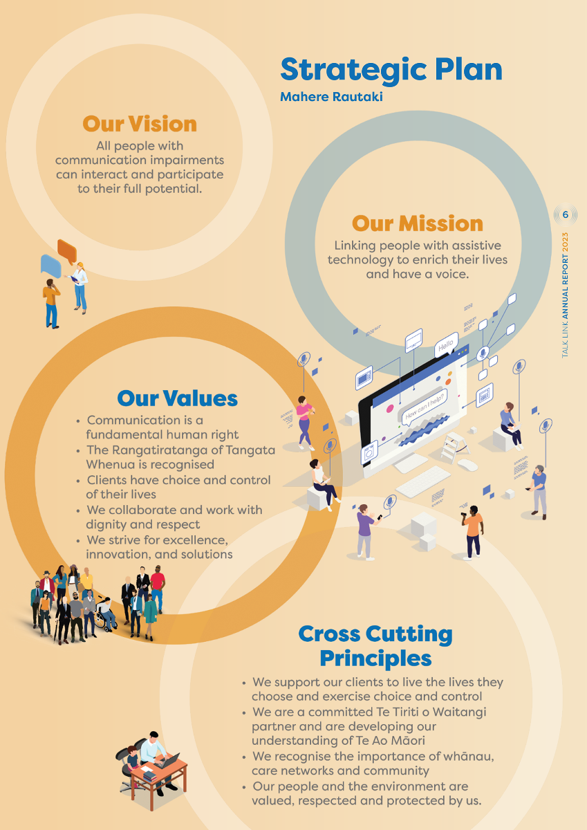
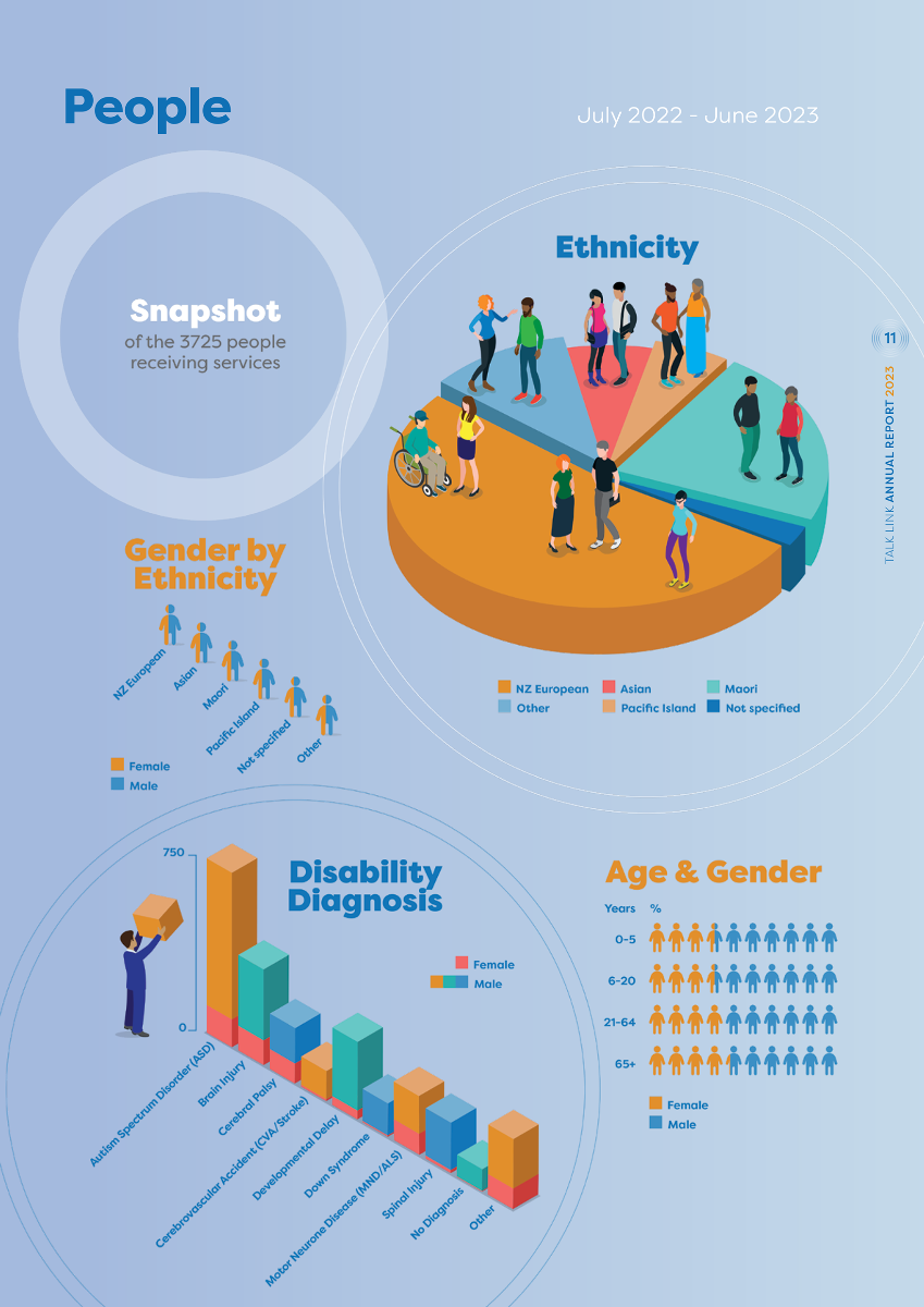
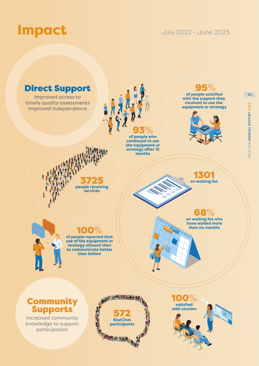
Infographics help tell a story, and part of the document review was considering the presentation of information pictorially.
Isometric illustrations – that make two-dimensional figures appear three dimensional – incorporating people were devised to lift the images off the page and add depth.
They all utilise orange and blue elements, sitting across large circle shapes of different tones and transparency, to convey statistics and valuable information. The graduated backgrounds give the pages cohesion, as well as movement.
You can download the report here.
